The Glass Lobby Myth: Why Transparency Does Not Guarantee a Public Welcome
A glass lobby can look open yet feel exclusive. Learn how scale, thresholds and everyday cues shape whether a building entrance welcomes people in.
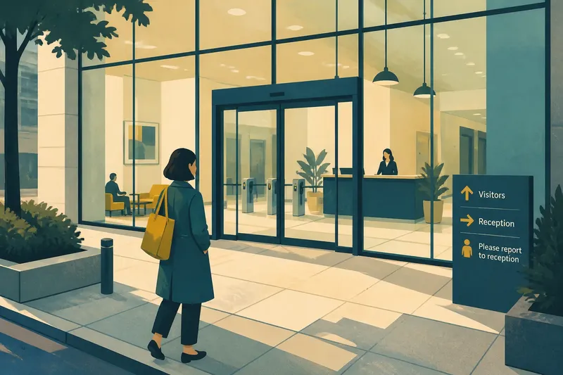
You can see the chairs, the bright floor and the lift through a glass lobby, yet still hesitate at the door. Glass lobby transparency makes a building visible; it does not, by itself, tell a passer-by whether they are welcome to enter. That message comes from the entrance as a whole: its scale, threshold and cues.
Seeing is not entering
A clear façade removes a visual barrier, but leaves other questions unanswered. Is this a public building, a private workplace or a hotel? Is the door for visitors? Where should someone go once inside? If the entrance offers no legible answers, transparency may expose an interior without making it accessible in the ordinary social sense.
This distinction matters because people read buildings before they approach them. A broad glazed wall can reveal reception staff and waiting areas, while also showing security gates, desks and signs that seem intended for someone who already knows the building. The view is open; the invitation may not be.
Nor is every lobby meant to be public. An office entrance can reasonably control access. The design question is whether its appearance communicates that boundary clearly, rather than borrowing the visual language of a civic welcome while leaving visitors uncertain.
Glass lobby scale
Scale shapes the first impression. A tall, uninterrupted glass façade can make an entrance feel grand, but also place the person approaching it in a subordinate position. A low canopy, visible doorway or human-scaled sign can make the point of entry easier to identify without changing the building’s overall size.
Proportion matters as much as height. If the main doors are lost within a long expanse of glazing, people may not know where to go. A change in frame colour, a clear handle or a distinct entrance bay can make the opening readable. Heavy revolving doors, deep setbacks and broad empty forecourts can have the opposite effect: they create distance between pavement and interior.
Consider what is visible at eye level, too. A reception desk set well back may appear remote, while a staffed counter near the entrance gives a visitor a clear place to direct a question. The issue is not whether a building looks impressive. It is whether a person can recognise the entrance and imagine their next move.
The threshold sequence
Between pavement and lobby, a person passes through a sequence of small transitions. A step, gate, security desk, mat, turnstile or second set of doors can signal a change in access. Even when each element is ordinary, their combination may feel like a test a visitor has not been told how to pass.
Designers can make that sequence more legible. A direct path from pavement to reception is easier to read than a route that bends behind a planter or disappears around a wall. A clearly marked visitor entrance helps distinguish welcome from general access. If screening is required, placing an understandable reception point before the barrier can explain where a guest should pause.
Imagine someone arriving at a glass-fronted community arts building for a meeting. They can see a reception desk, but the main doors carry no sign and a side gate appears to be the only opening. If a simple “Visitors and events” sign is placed beside the main handle, the person has a visible route and a reason to approach. The glass has not changed; the threshold has become easier to interpret.
Cues that invite
Small cues help people decide whether they belong. A readable directory, a welcome desk, a door that looks operable and signs naming public services all offer useful information. So do visible seating and activity near the entrance, provided they do not block the route or imply that lingering is forbidden.
Other cues can quietly discourage entry. “Authorised personnel only” signs, access gates immediately behind the glass, a blank reception desk or a polished interior with no visible wayfinding can make a visitor feel watched rather than welcomed. A security camera alone does not explain access rules, but paired with clear visitor information it need not define the whole experience.
Language should match the building’s actual use. Calling a private office lobby “open” can create confusion if the public cannot enter beyond reception. A sign that explains the boundary—such as where to report for an appointment—sets a more honest expectation. Welcome is not the same as unrestricted access; clarity is part of respect.
Reading a glass lobby?
Does more glass make a building more welcoming?
Not necessarily. Glass improves views into a space, but welcome also depends on a recognisable entrance, understandable access and signs that address visitors directly.
What makes a lobby feel intimidating?
People may feel out of place when an entrance is oversized, the doors are hard to identify or security equipment appears before any explanation. A distant desk and unclear visitor route can deepen that impression.
Can a private lobby still feel welcoming?
Yes, if it states its limits plainly and gives visitors a clear next step. A named reception point or appointment sign can make controlled access feel orderly rather than mysterious.
What should I notice from the pavement?
Look for the door, the path to it, signs for visitors and any visible place to ask for help. Notice whether the view through the glass clarifies those details or merely displays the interior.
Designing for legibility
For architects and building managers, a useful review begins at the pavement rather than the reception desk. Approach the entrance from the direction a visitor is likely to arrive. Check whether the door stands out, whether the route is direct and whether signs are visible before someone has to choose a door or cross a barrier.
- Make the public entrance visually distinct from service or staff doors.
- Place visitor information where it can be read before the threshold.
- Keep the route to reception visible from the entrance.
- Show where visitors should pause if access is controlled.
- Use seating and displays without narrowing the approach.
- Explain which parts of the lobby are open and which require permission.
These choices are not a substitute for access requirements or security planning. Where door operation, accessibility or screening depends on regulations and product specifications, consult the relevant local rules and qualified professionals.
A glass lobby is best judged by what it helps a stranger understand, not by how much of the interior it reveals. When the entrance identifies its door, route and boundaries, transparency can support a public welcome. Without those cues, the clearest façade may still leave the simplest question unanswered: where am I allowed to go?